One Page Checkout Vs. Three Page Checkout – Beragampengetahuan
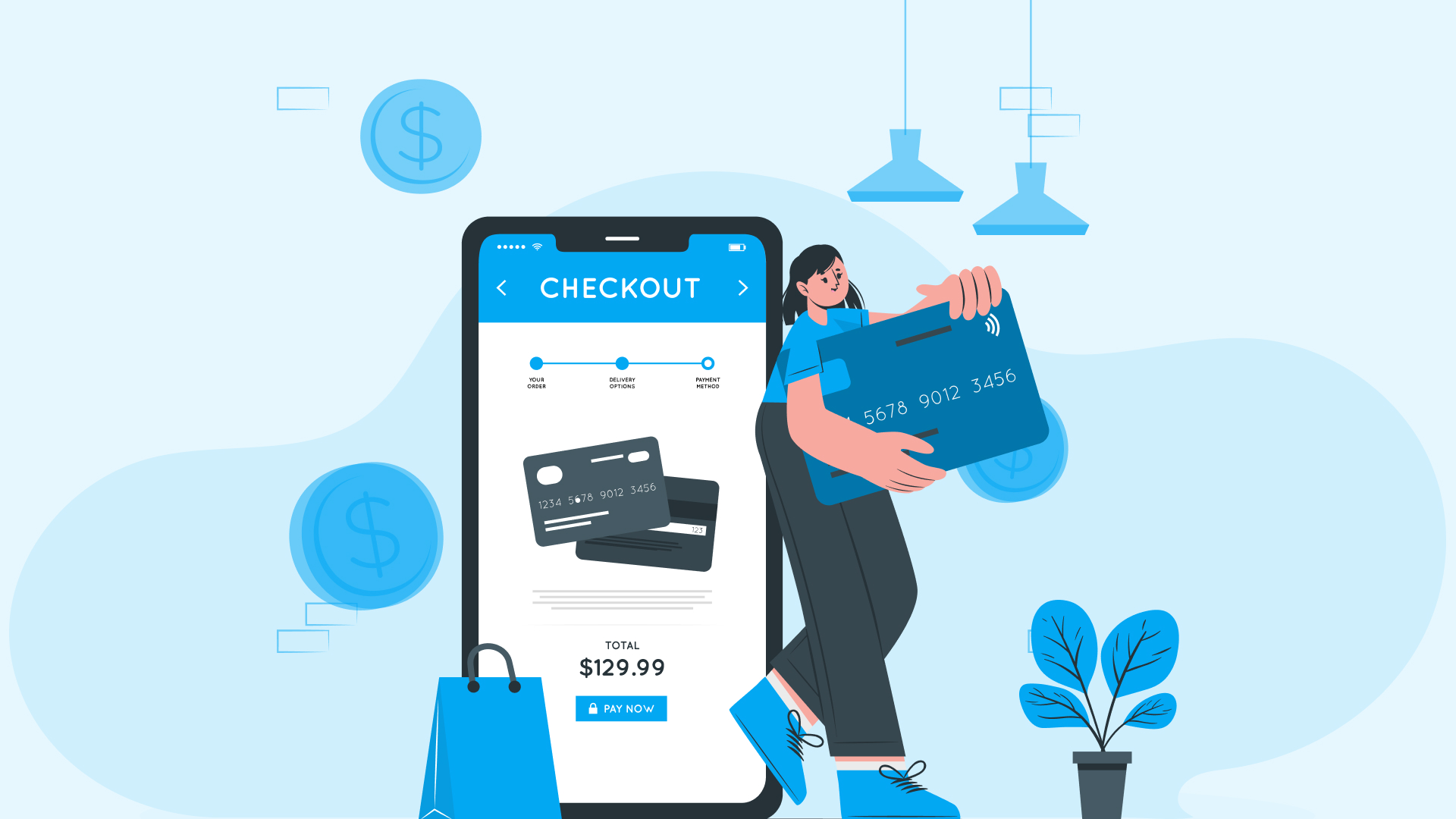
Shopify built the best-converting checkout online, already converting 15% more. They improved it with a new redesign—that’s shorter, faster, and more intuitive.
The interesting thing—merchants adopting Shopify’s One Page Checkout reported an average increase in conversion rates by 20%.
One-page checkout literally makes buying on Shopify stores faster and easier.
Instead of going through pages to complete a purchase, customers can enter all necessary information—billing and shipping details, payment information, and final check—all on just one page.
Why did Shopify choose to upgrade the three-page checkout it had before?
- Streamlined Checkout
- Intuitive and More Conversions
- Built on a Solid Platform
- Fully Customizable
It has a load time of under 2 seconds, ensuring a smooth and efficient transaction process.
Instead of having buyers click through multiple pages, everything they need to complete their purchase is now on a single page.
The design is intuitive, meaning it’s easier for buyers to use, and it’s optimized to increase their chances of purchasing. For example, sections are pre-filled for returning customers, speeding up their checkout even more.
One-page checkout built on Shopify that is fast, reliable, secure, and can handle many checkouts at once.
The new checkout seamlessly integrates with any apps or customizations you already have, so you don’t have to worry about anything breaking when you switch.
In addition to its refreshed appearance, the one-page checkout offers more language customizations than before.
See how seamless it is.
Contents
One-page Checkout Vs Three-page Checkout

What’s the need to compare both checkout layers?
It’s because each checkout offers distinct advantages and drawbacks for different business needs and customer preferences.
Choosing one-page and three-page checkouts should be based on your business requirements.
Let’s compare each checkout layer.
Pros and Cons of Shopify One-Page Checkout
| Pros | Cons |
|---|---|
| Everything needed for purchase is on one page with minimized steps and confusion, speeding up the process. | Some customers may feel overwhelmed by seeing all fields at once, if the form is long, especially mobile shoppers. |
| Fewer steps mean less chance of abandonment, leading to more completed purchases. | Simplified checkout means fewer chances for upselling, impacting cart values. |
| One page is easier to navigate, making checkout less daunting. | Offers only one URL, limiting visibility to track each stage to monitor any issue identification i.e. abandonment stages. |
| Works well on mobile devices, important for mobile shoppers. | |
| Minimizes distractions, leading to higher completion rates. | |
| Easy customization for you to match your brand and integrate features seamlessly with the checkout page. |
Pros and Cons of Shopify Three-Page Checkout
| Pros | Cons |
|---|---|
| Guides customers through each stage of checkout in a structured manner. | More steps mean more time to complete a purchase. Each step introduces a point where customers might leave. |
| Breaking the process into steps makes it feel more manageable. | May not be optimized for mobile devices, where users prefer quicker processes. |
| Allows for additional opportunities for upselling and cross-selling. | More steps can introduce more friction, frustrating some customers. |
| Easier to collect additional information without overwhelming customers. | Inconsistencies or slower load times between steps, discouraging completion. |
Summary Comparison
| Features | One Page Checkout | Three Page Checkout |
|---|---|---|
| Checkout Speed | Faster | Slower |
| Load Speed | Faster | Slower |
| User Experience | Simplified, less daunting | Structured, less overwhelming |
| Navigation | Same page | Back and forth |
| Conversion Rates | Higher due to fewer steps | Risk of higher abandonment due to multiple steps |
| Mobile Optimization | Highly responsive, more scrolling | Less optimized, more time consuming |
| Friction | Minimal | Increased due to multiple steps |
| Upselling Opportunities | Limited | More opportunities between steps |
A global consulting firm found that Shopify’s conversion rate surpassed the competition by up to 36%, with an average increase of 15%.
Deciding between a one-page and three-page checkout depends on your business needs, customer preferences, and technical capabilities.
How to Change Your Checkout Layout From Three-page to Single-page Checkout?

Changing your checkout layout is easy with Shopify.
Your store’s checkout is set to one page by default, but you can switch to a three-page layout.
Here’s how you can change the checkout layer;
- Go to Settings, then Checkout in your Shopify admin.
- Under Configurations, click Customize next to the checkout you want to change.
- Click the gear icon in the editor to access Settings.
- In the Checkout Layout section, choose between One-page or Three-page checkout.
- Save your changes.
Remember, the preview won’t update in real time, so check your storefront checkout to see the new layout after saving.
10 Tips to Optimize Your One-Page Checkout
Over 80% of customers who use Shopify’s 1 Page Checkout are likely to return for future purchases.
Looking at this stat, you wouldn’t want to miss out on optimizing your checkout page, right?
Tip #1 – Do Upselling and Cross-selling
A one-page checkout generally offers fewer opportunities for upselling directly on the checkout page, as all the needed information is merged together on one page.
However, you can still leverage upselling and cross-selling to boost average order value (AOV) and maximize revenue.
So, what you can do is, display products;
- On the thank you page.
- During the browsing and selection process.
- In personalized email recommendations.
Checklist
This allows you to capitalize on every opportunity to increase sales and improve the overall experience for your customers, even within the constraints of a one-page checkout.
Tip #2 – Reduce Form Fields for Faster Checkout
Will reducing form fields affect data collection?
Actually, no.
You’ll have only to collect what’s necessary from your side and please the customers.
All elements from the traditional three-page process are combined into a single page in a one-page checkout. This can sometimes lead to a long and overwhelming form for customers to go through.
The fewer fields a customer has to fill out, the quicker they can complete their purchase.
Simplified forms decrease the load on customers. When buyers see a short, straightforward form, they are less likely to feel overwhelmed and more likely to complete the purchase.
Complex and lengthy forms are a common reason for cart abandonment. Reducing the number of required fields makes it easier for customers to finish their transactions.
Checklist
You can now create a smoother, more user-friendly experience that significantly boosts conversion rates and improves customer satisfaction.
Tip #3 – Offer Quick Guest Checkout Option
Implementing a quick guest checkout option is a powerful way to optimize your checkout process.
It will make it easier for customers to complete their purchases and drive higher sales for your store.
Why is that?
- It shows that you respect your customers’ time and privacy, building trust in your brand.
- The process is faster, allowing customers to complete their purchases with minimal friction.
- Many users abandon their carts when faced with the requirement to create an account.
It automatically becomes convenient for the customer.
The customer comes again, purchases, and becomes a repeat customer.
Aren’t customer accounts needed as data?
Absolutely, customer accounts can be highly beneficial.
But making them mandatory can be risky. The added friction can lead to lost sales, damaging revenue more than the benefits gained from collecting customer data.
So, the best strategy is to offer a guest checkout option by default.
Checklist
When the purchase is complete, you can offer them the option to create an account using the information they’ve already entered on the thank you page.
Make the account creation process as simple as possible, using the information they provided during checkout.
Once they have their account ready, customizations that are made through Checkout Extensibility integrate smoothly with Shop Pay, which converts up to 50% better than guest checkout.
This can be a simple checkbox or prompt that saves their details for future purchases.
Tip #4 – Recover Lost Sales with Cart Reminders
Cart abandonment is a common concern in e-commerce, with many customers leaving their carts before completing a purchase.
That’s why cart reminders are a powerful tool for recovering lost sales.
They re-engage customers and encourage them to finish their transactions.
Checklist
Tip #5 – Accept Various Payment Methods
One of the main reasons for abandonment is the unavailability of preferred payment methods for customers and a complicated payment process.
Customers have different preferences when it comes to payment methods. Some may not have access to specific payment methods or may prefer one method over another due to security concerns or convenience [different regions have preferred payment methods].
That’s why, by accommodating different customer preferences, you reduce barriers to purchase.
Checklist
Tip #6 – Remove Unnecessary Links for Clarity
Distractions can be your brand’s biggest enemy.
Irrelevant links, promotional banners, ads, or pop-ups could distract customers from completing their purchases, leading to high abandonment rates.
So, avoiding all kinds of distractions on your checkout page is better.
Checklist
Removing unnecessary links and distractions creates a more focused and efficient checkout experience that can lead to higher conversion rates, reduced cart abandonment, and improved customer satisfaction.
Tip #7 – Enable Address Autocompletion
Manually entering address details during checkout can be time-consuming and error-prone for customers.
This sometimes leads to frustration and order inaccuracies.
What actually happens?
- Mistakes in typing or formatting details can result in incorrect or incomplete info.
- Typing out full addresses can be tedious, especially on mobile devices.
- Customers may use different variations or abbreviations for their addresses.
That’s why enabling address autocompletion can streamline the checkout process and improve the accuracy of any address entry.
Checklist
Tip #8 – Leverage Your Brand on Checkout Page
Are you settling for generic or bland designs that fail to reflect your brand’s identity?
Then STOP.
If you’re a great businessperson, you’d understand the importance of every customer touchpoint, including the checkout page, to showcase your brand.
It’s not just about logos, colors, and fonts; it’s about integrating your brand’s messaging, tone, and trust signals, like security badges & customer testimonials.
Why pass up the chance to make a lasting impression?
Checklist
You can also add new functionalities to your checkout, including UI extensions, custom logic, post-purchase pages, and pixels without needing your code through the Shopify Checkout Extensibility.
Tip #9 – Attract New Customers with Discounts
Discounts make customers extremely happy.
If you want to;
- Generate buzz around your brand
- Create excitement
- Attract price-sensitive customers
- Make them try out your products/services
- Grab their attention
Offering discounts is a powerful strategy for your e-commerce store.
For example;
- Get 15% off your first purchase!
- Get 20% off for the next 48 hours!
- Hurry! 20% off ends in [timer showing 48 hours]
- Get our New Customer Bundle for $45 (originally $60).
- Enjoy 15% off your first order with code WEL15
- Sign up for our newsletter and get 15% off your first order.
- Refer a friend and you both get $10 off your next purchase!
By strategically offering discounts to attract new customers, you can;
- Drive traffic to your store.
- Increase sales.
- Ultimately, grow your business.
Checklist
It’s all about balance.
Tip #10 – Encourage Purchases Using Psychological Triggers
Drive sales by leveraging certain mental and emotional responses that influence buying behavior.
Many brands often utilize these psychological triggers to make customers act quickly.
If you want to;
- Drive quick decision-making
- Reduce procrastination.
- Build trust and credibility.
- Increase customer confidence in making a purchase.
- Build goodwill and a positive relationship with customers.
- Encourage repeat purchases and loyalty.
- Encourage customers to feel like they are getting a better deal.
You should definitely make use of these psychological triggers. For example;
- Only 3 items left in stock! Order now before it’s too late!
- Flash Sale! 20% off ends in 02:12:45
- Get 30% off today only!
- Rated 4.8 out of 5 stars by 1,200 customers
- Jane from San Francisco just bought this!
- Share your look with #ShopName and get featured!
- 100% Satisfaction Guarantee or Your Money Back!
- Get a free sample of our best-selling serum with every order!
- Was $150, Now $100 – Save $50!
Checklist
With this, you can create a more engaging shopping experience for your customers.
What’s Your Choice?
Choose the format that best fits your business needs and customer preferences to optimize your checkout process.
One-page checkout is perfect for a fast, efficient, and mobile-friendly experience.
It simplifies the process, reduces friction, and can lead to higher conversion rates.
On the other hand, Three-Page Checkout offers a structured, step-by-step process that can feel less overwhelming and allows for more opportunities to upsell and spreads out the cognitive load. Still, it can also be slower and increase the risk of abandonment.
Ultimately, by understanding every strength and weakness, you can make a better choice about your checkout process and improve your customers’ shopping experience.
rencana pengembangan website
metode pengembangan website
jelaskan beberapa rencana untuk pengembangan website, proses pengembangan website, kekuatan dan kelemahan bisnis pengembangan website
, jasa pengembangan website, tahap pengembangan website, biaya pengembangan website
#Page #Checkout #Page #Checkout